How to use the Walking and Cycling Index data tool
Guidance and helpful tips on how to get the most out of our Index dashboards.

The attitudes and behaviour dashboards show the information we collected on what residents of the participating cities think and do in relation to walking and cycling.
For example, "What would help people cycle more?" or "How often adult residents cycle".
This information was collected from participating locations, which differed from year to year.
The latest participating locations from 2023 are:
- Aberdeen
- Belfast
- Birmingham*
- Bristol
- Cardiff
- Cork Metropolitan Area
- Dublin Metropolitan Area
- Dundee
- Dunfermline
- Edinburgh
- Galway Metropolitan Area
- Glasgow
- Greater Cambridge
- Greater Manchester
- Inverness
- Limerick Shannon Metropolitan Area
- Liverpool City Region
- Perth
- Southampton City Region
- Stirling
- Tower Hamlets
- Tyneside
- Waterford Metropolitan Area
* Birmingham participated in 2015, 2017 and 2023. Birmingham is part of the West Midlands which participated in 2019 and 2021.
In some locations, we have information at a sub-division level. They are:
- Greater Cambridge
- Greater Manchester
- Liverpool City Region
- Southampton City Region
- Tyneside
- West Midlands.
Help
We have a help overlay on all of our dashboards. This is accessible via the "help?" icon shown below.
![]()
The help overlay gives you some hints about the following functionality:
- Single location vs compare cities
- Filtering
- Questions and question options
- Navigation bar
- Data card
- Demographic comparison
- Viewing data across years
- Viewing location sub-areas using the "Drill down" function
- Comparing to regional aggregates
- Combining answers
- Changing units
- Filtering responses in the chart (behaviours only)
- Copying charts to use elsewhere.
Single location vs compare cities
You can choose to focus on a specific location, or to compare cities and districts in the index data. Examples of single locations include "UK cities", "English cities", or a specific city such as "Bristol".
For comparisons, you can select multiple cities e.g. "English index cities" or by picking individual cities from across the participating countries.
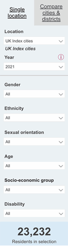
Filtering
The filter on the left side of the dashboard allows you to narrow the field of participants down using several categories.
The first is which year of data you are looking at. Here you can select just one year. We cover viewing data across years later in this guide.

Other filter options include
- Gender
- Ethnicity
- Sexual orientation
- Age
- Socio-economic group
- Disability
In some cases, these options are grouped into different bands. For example in the age option, we have 5-year and 10-year bands.
As you use the filter options the number of residents in the selection will change - this is shown at the bottom of the filter in large text.
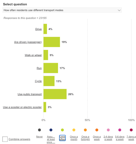
Questions and question options
Specifically, the following questions:
- What would help people cycle more
- How do people see themselves in relation to cycling
- What would help people walk or wheel more
- How do they feel about their local area
- What would make their local area better
- What interventions they support
- How they rate their local area for walking and cycling
- Where they would like to see government spending focused
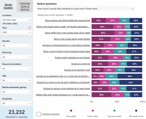
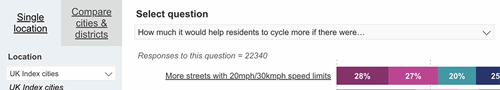
Many of the questions are matrix questions, where people are asked a question with several options for example, "What would help people cycle more?" has options for "Fewer motor vehicles on our streets" and "More cycle routes along quiet streets" against which people answered "Very useful", "Fairly useful", "Not very useful", "Not useful at all".
When looking at a single location, you can see all options side by side in the chart.
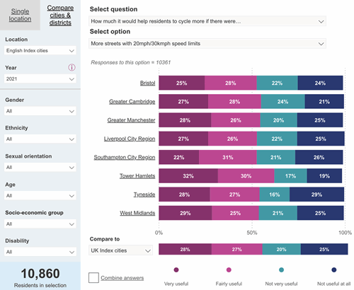
When comparing locations, you need to select which option you want to view for the question.
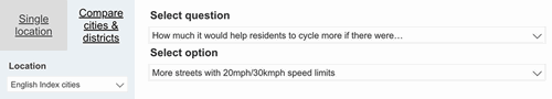
You can then see locations side by side for that particular question option.

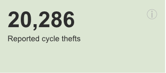
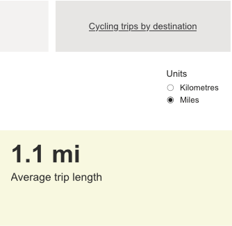
Data cards
In the City Data, Trips, and Benefits dashboards, we show some data in card format. Cards show a figure and a description of that data. When a note for that card is available, an ⓘ icon is displayed, which indicates that there is a note for this card. You can show the note by hovering over the icon.
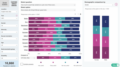
Demographic comparison
To compare how people answered a question across a demographic you must select the label for the bar of the chart you want to look at. For example in the initial state the dashboard loads in, if you click the label for "More streets with 20mph/30kmh speed limits" you will see the demographic chart load on the right side of the screen.
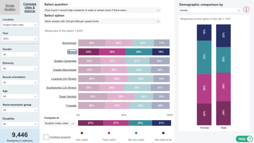
The demographic chart initially loads in the Gender options. You can use the dropdown at the top of the demographic chart to view different demographics. You have the following demographic options to choose from
- Gender
- Transgender
- Ethnicity
- Sexual orientation
- LGBTQ+
- Age
- Socio-economic group
- Disability
- Housing tenure
- Children in household
Viewing data across years
To see how the data in a bar chart in the dashboard changed between years, hover over that bar, and a tooltip window will appear with a chart showing this information. In some cases, it will also display notes relevant to these cards.
The same comparison can be seen when hovering over a data card in the City Data, Trips, and Benefits dashboards.
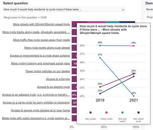
There are some instances when this function is not available:
- when you have selected a region or country level because the participating cities were not always the same
- when Tower Hamlets has been selected, because the method of survey collection was different in 2019
- when Sexual Orientation has been selected in the filter because that was not asked in 2019
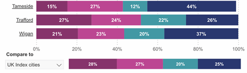
Viewing location sub-areas using the "Drill-down" function
Some locations have data at a sub-area level. For example, Manchester has 10 sub-areas. To see these sub-area locations you need to activate "Drill down mode" on the chart. This can be done by selecting the downward arrow at the top right corner of the main chart.
![]()
Once activated, you can click on a location bar label and that will take you to that bar’s sub-areas.
To move up a level back to the original location, in this example Manchester, click on the up arrow adjacent to the icon you clicked to activate drill down mode.
![]()
To deactivate the drill down mode you will need to click on the "drill down mode" button again. This will mean when you click on a bar label it will show the demographic comparison chart again.
Comparing to regional aggregates
When you are working in "Compare cities and districts" mode, you can use the chart at the bottom of the dashboard to compare your results to English, Scottish and UK cities. You can select the option using the dropdown menu on the left side.
The comparison chart may not total 100% when answers are combined due to rounded values being added together.


Copying charts to use elsewhere
To take a copy of a chart, you need to take a screenshot of it.
For PC users, you can take a screenshot of your whole screen by holding down Alt + PrtScr. An image of the window will be copied to the clipboard. You can then paste this into another application to use it. Some versions of windows have a Snipping Tool to enable you to capture parts of a screen. There’s some guidance on the Snipping Tool here.
For Mac users, you can take a screenshot of your whole screen by holding down ⌘ + shift + F3 or ⌘ + shift and F4 to take a screenshot of a part of your screen.
For phone and tablet users, you can usually take a screenshot by holding the power and volume buttons at the same time. You should consult your device instructions for more information.